Once you’ve selected your template and launched the editor, you can edit the existing section blocks by clicking into them, or choose to add additional Blocks/Elements from the left-hand sidebar.
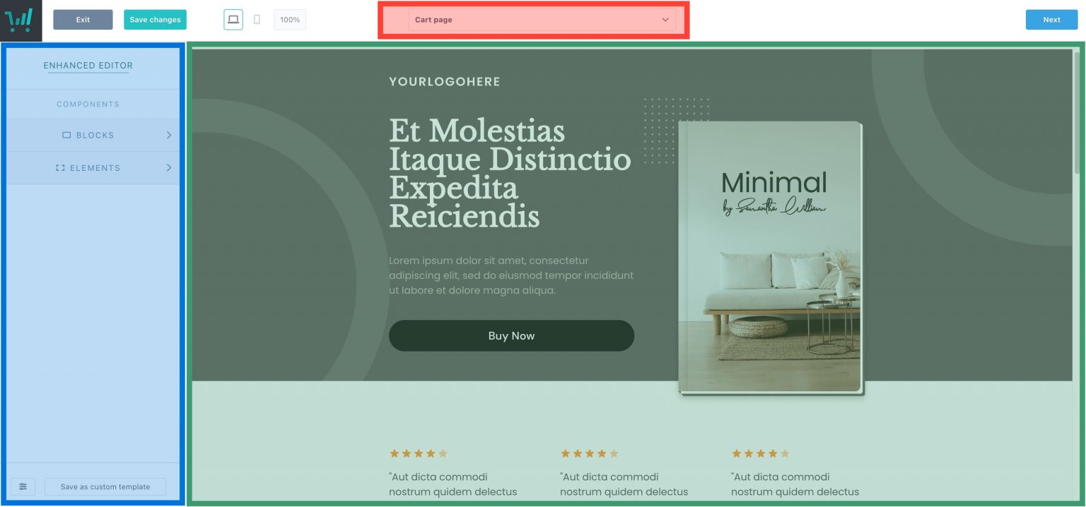
Below is an example overview of the new and improved editor when working with a new template:

When you select an element in the main editor area (right-hand column), you’ll have a range of options shown in the left-hand column, letting you change the settings of that element. Some elements will even let you select sub-elements, such as text or images so that you can further customize the very individual pieces.
When selecting the Blocks/Elements options within the left-hand column, you will be able to drag and drop those elements into the editor area (right-hand column). You can then rearrange elements once they’re added to the editor area.
All of your checkout pages (cart, upsell, downsell, success page) can be found within the dropdown top-middle). You’ll also be able to connect an existing funnel item here as well. See more on creating funnel items in our guide: Creating a funnel and upsell pages.
Blocks
All new template designs are built using the new Blocks feature that are fully customizable. You can opt to keep every design element that’s pre-built into these blocks, swap blocks out, adjust their colors, and even disable certain design elements entirely.
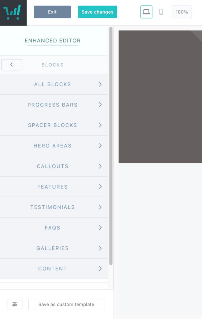
There are a number of block types that can be added to your design to make your checkout page truly your own:

- Progress Bars help to showcase where in the checkout process your customers are and can be placed throughout your sales page
- Spacer Blocks add gradient colors between your designed blocks for a touch of flair between your other elements. You can also drag page elements into these spacer blocks to build out and design other sections for your page.
- Hero Areas are typically used for your header section of your page and where you’d showcase your product with an image or video and where your main sales headline/subheading would go.
- Callouts help you to showcase your product pricing or special offers
- Features pre-built text boxes to help you detail your product offering and inclusions
- Testimonials An enhancement on our existing Testimonials element, this section features images and text boxes to showcase customer reviews
- FAQS Similar to our existing FAQ section, but with more color and formatting customization to help detail answers to frequently asked questions
- Galleries now offers the ability to highly your truly Instagrammable imagery
These blocks are interchangeable between templates, can be mixed-and-matched, and color customized to fit your branding and to get a truly one-of-a-kind design to showcase your product and branding.
Elements
Elements are the features and functionality you’ve come to know from our Classic editor and include functionality such as Text, Video, HTML sections.
You can add elements into blocks on your page or checkout area.
Saving Templates (to reuse)
Once you’ve designed a sales page that you’re happy with, you may wish to save that template so that it can be used across other products or with other ThriveCart users.
To do this, you can select the “Save as Custom Template” button in the bottom left of the editor, where you’ll see a pop-up asking whether you want to make it shareable and what you want to include in the template.
When you save a template, this will also be available in your ‘My templates’ area of your design gallery, and you can reuse this on other products and funnels.
Additionally, if you’re just wanting to save specific blocks or elements from within a page to reuse easily across other pages/products, then you can also use the save/load custom block/element in the bottom-left of the editor when either element is selected.

Multi-Step vs Single Step Checkouts
Similarly to our Classic checkout editor, every checkout can be set as a single-step or multi-step checkout to choose how you are collecting data from your customers.
A single step checkout requires all customer details to be input on the same page before the customer can complete their order, while multi-step checkouts break the steps down even further and create a secondary page where payment information is collected.
To switch between the two, you can select the option in the left-hand menu.

Something else to note with Multi-step checkouts is that you can have content set to show only on specific steps, giving you a huge amount of customization.
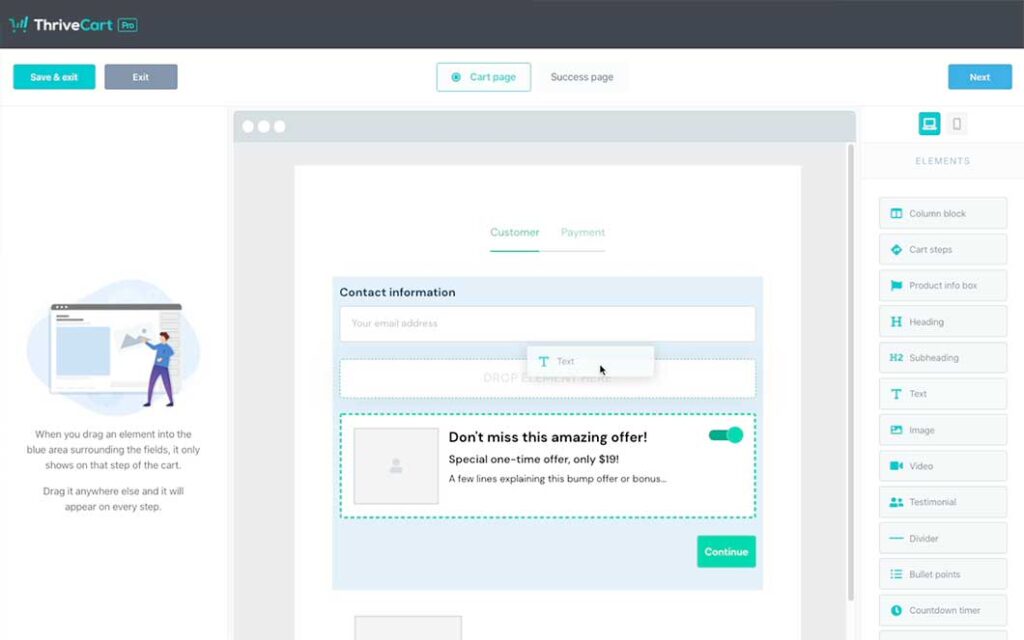
When you go to drag or move elements around, you’ll see a blue shaded background appear (see below for example). This symbolizes the content area for that Step. So anything added within that area will only show on the step that you’re on.
For example, you could drag the bump offer element out of this area into the general page section, switch to the payment step, and then move the bump into this step.
That way, the bump offer would only show to customers when they get to the payment step and not before.

Tips and Tricks related to navigating the checkout editor

 All Rights Reserved