Revenue
Infrastructure for
Modern Creators
Sell digital & physical products, courses, memberships, and subscriptions with high-converting checkouts, powerful funnels, and thousands of automations.
Revenue
Infrastructure for
Modern Creators
Sell digital & physical products, courses, memberships, and subscriptions with high-converting checkouts, powerful funnels, and thousands of automations.
Trusted by 75,000+ creators and businesses worldwide
Trusted by 75,000+ creators and businesses worldwide
Selling Online
Shouldn't Require
10 Different Tools
one unified platform
Platform
Five Pillars. One Platform.
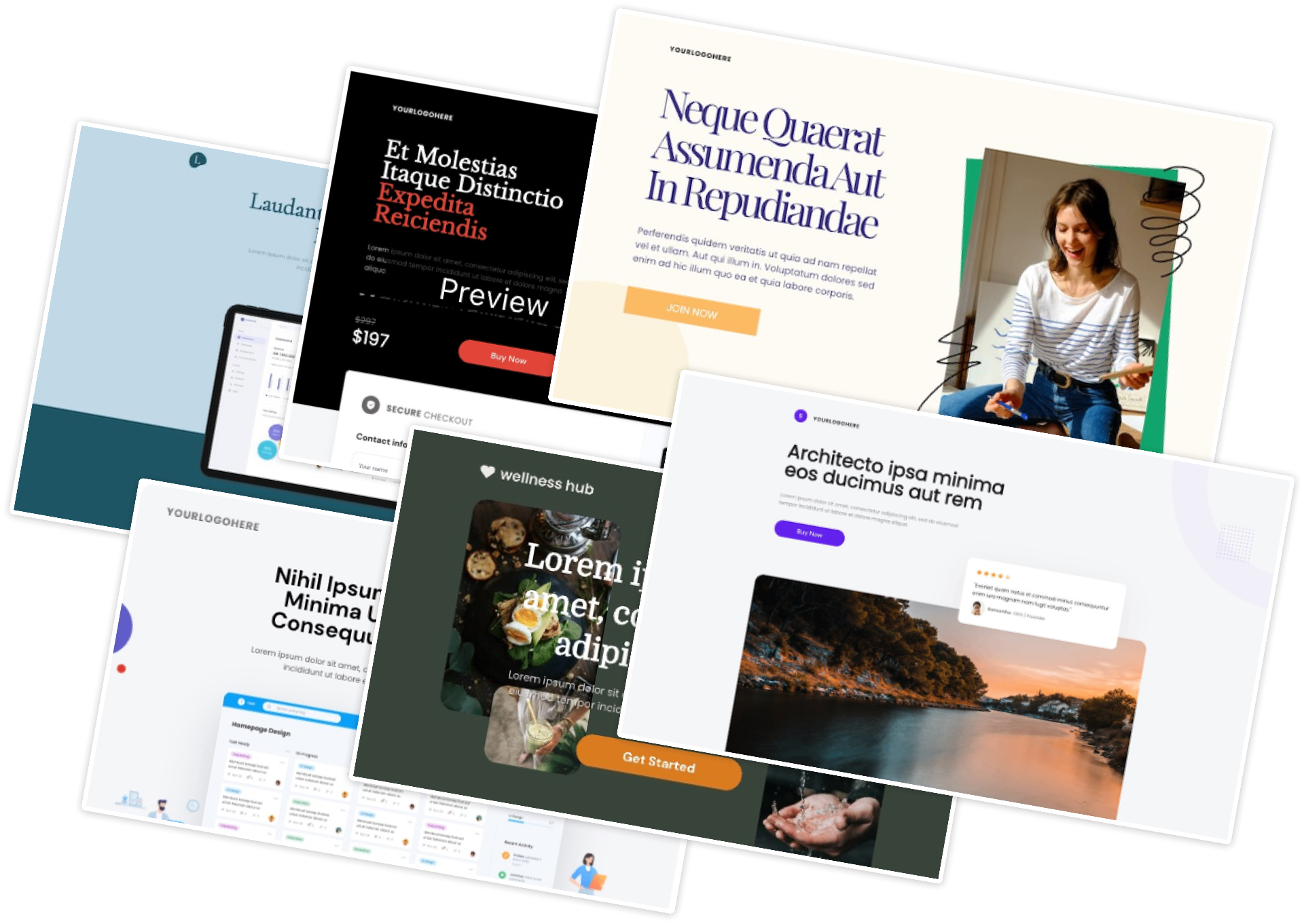
High-Converting Checkouts
High-converting fully mobile optimized checkout, trained on 70+ million transactions. Host videos, digital products, lead captures and use AI to craft the perfect visuals.
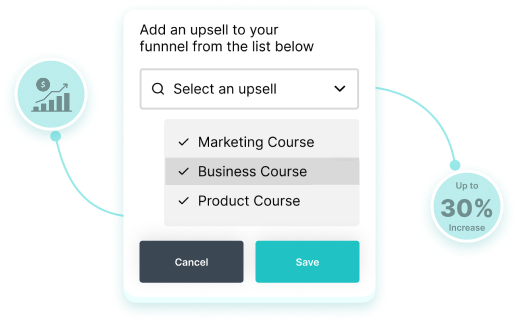
Funnel SequencingAdds +118% AOV
Automated sales funnels with precise step sequencing and behavioral rules (multiple bumps, 1-click upsell & downsell, pro-rated payments and access controls).
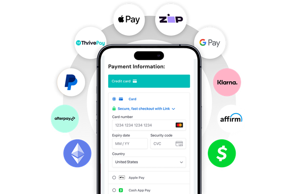
Global Payments, Compliance & Subscriptions
100+ global payment options across Stripe, PayPal and ThrivePay Installments. Flexible 1-click subscription plan upgrades and downgrades, friction-free. Always stay compliant with taxes and global compliance built in (inc. PCI-DSS & GDPR).
Built-In Course &Community Platform
A branded community wrapped around your courses. Grow LTV, drive engagement, gamify learning, and sell more to the members you already have.

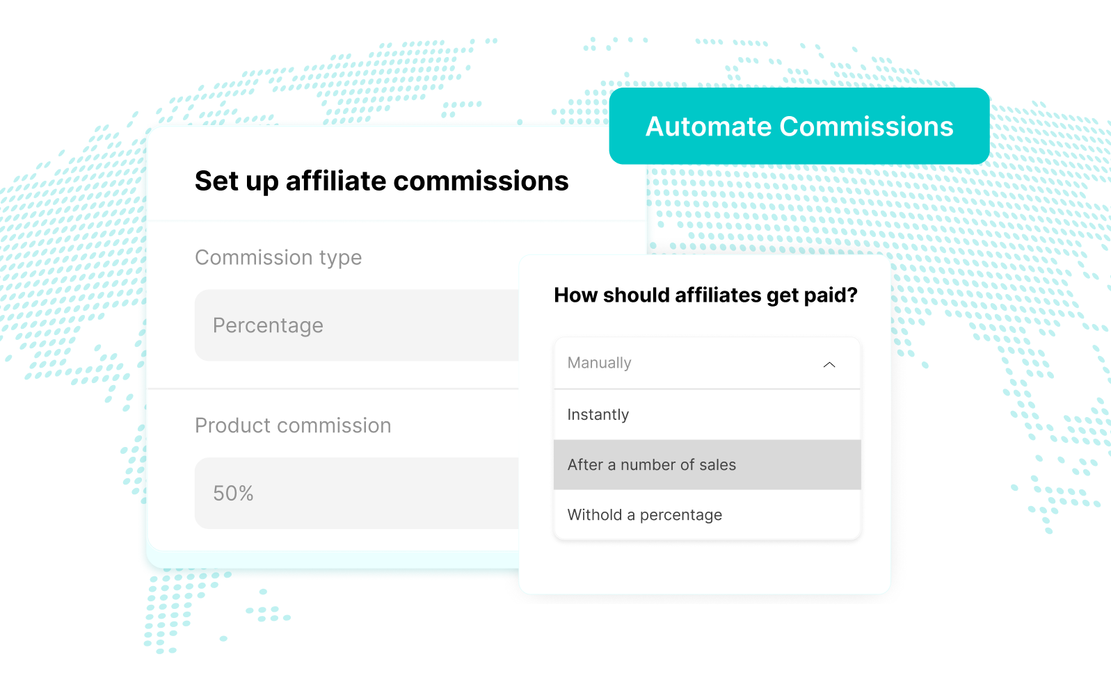
Built-In Affiliate Management
Recruit, manage, and pay affiliates directly from your dashboard — with automatic tracking, flexible commissions, 2nd-tier affiliate support, and automated payouts.
Demo
Build Your Revenue Engine in Minutes
Conversion
Features That Drive Revenue
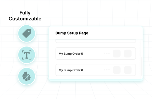
One-click Order Bumps
Add complementary offers directly inside your funnel — customers select with just 1 click.
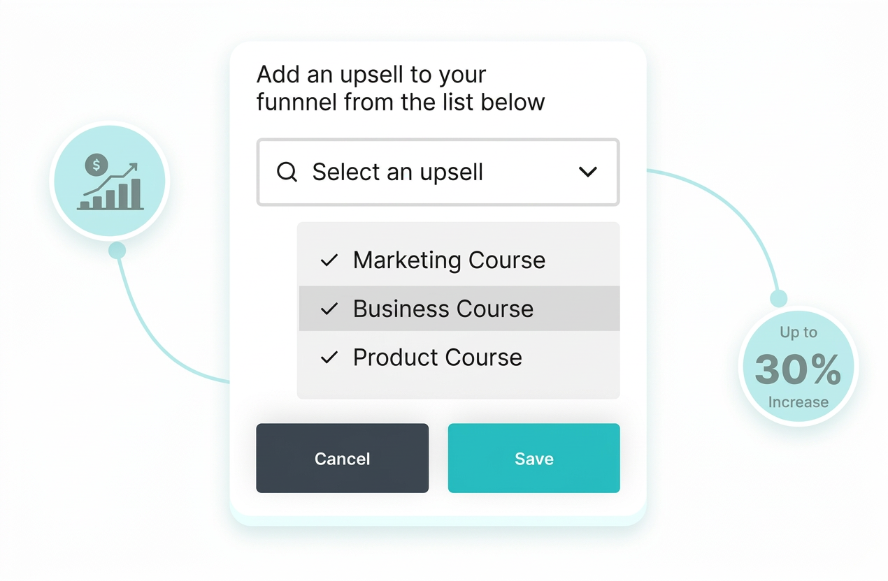
One-Click Upsells/Downsells
Increase average order value instantly with post-purchase offers that converts at 118%.
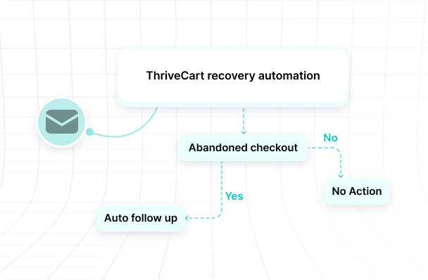
Abandoned Cart Recovery
Automatically recover lost sales with smart email sequences and exit-intent triggers. (ConvertBox)
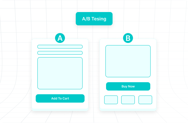
A/B Testing
Optimize your funnels with built-in split testing. Know what converts and double down.
Coupons & Discounts
Create and manage discount codes, promotional offers, and automatic coupon rules to boost conversions.
Payments
Sell Anywhere in the World
Accept payments from customers worldwide with every major payment method.
Subscriptions
Subscriptions Without the Complexity
Flexible billing cycles
Weekly, monthly, annual, or custom intervals. Pause & resume, retention offers & more.
Upgrades & downgrades
Boost AOV by 118%. 1-click up/down grades, conditional logic and seamless prorating.
Churn buster
Automatically notify of upcoming payments, card updates and retries.
Subscription analytics
MRR, ARR, NRR, LTV, cohort data, churn & more at a glance.

Ecosystem
Everything Your Creator Business Needs
Checkout platform
High-converting checkouts that work globally
Affiliate center
Recruit, manage, and pay partners effortlessly
Academy platform
Courses, memberships, and communities in one branded hub
Analytics
Real-time revenue tracking and insights
Automation
Connect with 1000+ email, integrations and marketing tools
Integrations
Works With Your Existing Stack
 Stripe
 PayPal
 ActiveCampaign
 ConvertKit
 Zapier
 Mailchimp
 DripStripePayPalActiveCampaignConvertKitZapierMailchimpDrip
 HubSpot
 GetResponse
 Webhooks
 AWeber
 Infusionsoft
 Kajabi
 TeachableHubSpotGetResponseWebhooksAWeberInfusionsoftKajabiTeachable
Testimonials
Loved by 75,000+ Creators

GEMMA BONHAM-CARTER
Course Creator School and The Passive Project
"I was considering Kajabi and Kartra platforms, but if I built my house on that platform I'd be paying over $1,800 per year. And when you're starting out you want to bootstrap."

CHRIS HUNTLEY
Course creator and owner of TheRiseToTheTop.com
"With ThriveCart, it's all incredibly fast and easy. I learned the hard way. And as soon as I moved over to ThriveCart, I've never needed to go back"

KEVIN FIEDLER
YouTube marketing coach
"It is so easy to setup a sales page or funnel, checkout and bump order with this software. They have a built-in 'page builder' with all the necessary components."

KEITH E.
Web consultant
"The team got Pro+ setup in under an hour, and we have already seen an increase in AOV from adding an additional order bump."

DOM WELLS
CEO and Founder of Onfolio
"I'm getting that 'kid in a candy store' feeling. Hands-down best purchase decision I've ever made. ThriveCart is amazeballs."

MICHAEL IPPERSIEL
MJI Solutions
"Upgrading to ThriveCart Pro+ transformed how I run my business — affiliate setup became seamless, reporting improved drastically."

CHRISTINA
Founder of Passive Income Journeys
"I more than doubled the conversion rate – it was more like 4x or 5xing. Going from a third-party, scammy-looking checkout page to my own branded one really helped."
GEMMA BONHAM-CARTER
Course Creator School and The Passive Project
"I was considering Kajabi and Kartra platforms, but if I built my house on that platform I'd be paying over $1,800 per year. And when you're starting out you want to bootstrap."
CHRIS HUNTLEY
Course creator and owner of TheRiseToTheTop.com
"With ThriveCart, it's all incredibly fast and easy. I learned the hard way. And as soon as I moved over to ThriveCart, I've never needed to go back"
KEVIN FIEDLER
YouTube marketing coach
"It is so easy to setup a sales page or funnel, checkout and bump order with this software. They have a built-in 'page builder' with all the necessary components."
KEITH E.
Web consultant
"The team got Pro+ setup in under an hour, and we have already seen an increase in AOV from adding an additional order bump."
DOM WELLS
CEO and Founder of Onfolio
"I'm getting that 'kid in a candy store' feeling. Hands-down best purchase decision I've ever made. ThriveCart is amazeballs."
MICHAEL IPPERSIEL
MJI Solutions
"Upgrading to ThriveCart Pro+ transformed how I run my business — affiliate setup became seamless, reporting improved drastically."
CHRISTINA
Founder of Passive Income Journeys
"I more than doubled the conversion rate – it was more like 4x or 5xing. Going from a third-party, scammy-looking checkout page to my own branded one really helped."
CHRISTINA
Founder of Passive Income Journeys
"I more than doubled the conversion rate – it was more like 4x or 5xing. Going from a third-party, scammy-looking checkout page to my own branded one really helped."
MICHAEL IPPERSIEL
MJI Solutions
"Upgrading to ThriveCart Pro+ transformed how I run my business — affiliate setup became seamless, reporting improved drastically."
DOM WELLS
CEO and Founder of Onfolio
"I'm getting that 'kid in a candy store' feeling. Hands-down best purchase decision I've ever made. ThriveCart is amazeballs."
KEITH E.
Web consultant
"The team got Pro+ setup in under an hour, and we have already seen an increase in AOV from adding an additional order bump."
KEVIN FIEDLER
YouTube marketing coach
"It is so easy to setup a sales page or funnel, checkout and bump order with this software. They have a built-in 'page builder' with all the necessary components."
CHRIS HUNTLEY
Course creator and owner of TheRiseToTheTop.com
"With ThriveCart, it's all incredibly fast and easy. I learned the hard way. And as soon as I moved over to ThriveCart, I've never needed to go back"
GEMMA BONHAM-CARTER
Course Creator School and The Passive Project
"I was considering Kajabi and Kartra platforms, but if I built my house on that platform I'd be paying over $1,800 per year. And when you're starting out you want to bootstrap."
PricingOur pricing plans
Change your plan whenever you want. Every plan comes with ThriveCart Academy, our community platform.Whether you're just starting out, are looking to upgrade, or want a custom plan, we've got an offer for you. Buy ThriveCart with or without advanced offerings, or upgrade anytime after. Each ThriveCart license gives access to a ThriveCart Academy plan.
ThriveCart Standard
Great to get started
Checkout & Cart
- Customized Cart and Checkout Pages
- Checkout in 100+ Countries
Sales & Funnels
- Unlimited Products & Funnels
- 1 Bump Offer
- 1-Click Upsells & Down Sells
- Advanced Funnel Automation
- A/B Split Testing
- Abandon Cart Recovery
Payments & Billing
- Integrations with Payment Processors
- Buy Now Pay Later, Split Pay, Pay-As-You-Like & Subscription Billing
ThriveCart Academy Starter Plan
- Unlimited Courses/Students
- Up to 2,000 Community Members
- Up to 10 Communities
- Gamification/Quizzes/Certificates
- 100 GB Video Storage
- 2 GB Max File Size per Video
- HD Streaming (1080p) and More..
Integrations
- 100+ Direct Integrations
ThriveCart Pro+
Scale without limits
Includes everything on Standard, plus:
Revenue Optimization
- Pro+ Sales & Reporting Tools
- Multiple Order Bumps (↑ 30% AOV increase)
- Crypto Payments (↑ 7% AOV increase)
- Tax Inclusive Pricing (↑ 22% sales increase)
- Sales Tax Automation
- QR Codes
- Coupons Offers & Analytics
- UTM Tracking
Advanced Subscriptions
- Subscription 1-Click Upgrades & Downgrades
- Subscription Dunning
- Subscription Analytics & Funnel Comparisons
Affiliates & Partnerships
- Affiliate Center & Automated Payouts
- Joint Venture Platform & Automated Payouts
Customization & Admin
- Custom Branding & Domains
- Multi-user Permissions
- Business Intelligence Reporting
ThriveCart Academy Growth Plan
- Unlimited Courses/Students
- Up to 10,000 Community Members
- Unlimited Communities
- Custom Community Domain
- Gamification/Quizzes/Certificates
- 500 GB Video Storage
- 4 GB Max File Size per Video
- HD Streaming (1080p) and More..
ThriveCart Enterprise
For high-volume sellers
Includes everything on Pro+, plus:
- Includes ThriveCart Pro+
- Tailored implementation & onboarding
VIP Service
- White-Glove Setup
- Dedicated Account Manager
- Platform Migration
- Priority Support & Fast Response
- Quarterly Strategy Reviews
Enterprise Scale
- Volume-Based Processing Rates
- Unlimited Team Seats
- Multi-Brand & Marketplace Support
- Custom API & Integration Support
- Headless for Platforms
Advanced Control
- Enterprise SLAs
- Advanced Security & Compliance
- Custom Contract Terms
ThriveCart Academy Scale Plan
- Unlimited Courses/Students
- Unlimited Community Members
- Unlimited Communities
- Multi Branded Communities
- White-Label Branding
- Unlimited Video Storage
- 10 GB Max File Size per Video
- 4K Streaming
- Team and Multi-Admin Access
- Custom Domains and More
Ready to commit for life? Available as a lifetime option. Get Started.
Frequently Asked Questions
Still looking for answers? or visit our blog for updates on newest features and integrations!