
70% of shopping carts get abandoned before checkout.
And while we can’t get that number down to zero, what we can do is maximize your checkout conversion rates.
In this article, ThriveCart gives you 12 solid strategies to increase checkout conversion rates, with actual proof that they work.
Why Your Checkout Page is Leaking Money (and How to Fix It)
“But my checkout page isn’t leaking money!” you say in fear.
Sadly, there’s a good chance that it is. Like we said, around 70% of shopping carts are abandoned (according to the Baymard Institute and other sources), and that figure goes even higher for mobile checkouts.
So, why do the customers just slip away here – sometimes just seconds before buying?
Extra fields to fill out, confusing layouts, unexpected costs, forcing account creation, unclear shipping timelines, or a slow-loading page… all of these things are like little leaks in the pipe of your business, letting customers pour out.
The good news is that fixing these leaks is pretty straightforward: remove as many hurdles as possible, and add tools that make it smoother to get from ‘Add to Cart’ to ‘Thank You for Your Order’.
Soon we’ll look at all these strategies to maximize your checkout conversion rates, but first we want to address a common question: what’s a good conversion rate?
What is a Good Checkout Conversion Rate? (2025 Benchmarks)
Your checkout conversion rate is the percentage of people who start the checkout process and successfully complete a purchase. If 100 visitors begin the checkout and only three actually buy, your checkout conversion rate is 3%.
So, What Counts as “Good”?
The global average ecommerce conversion rate in 2025 hovers around the 2-4% range, and varies from industry to industry.
For example, retail like clothing and jewelry converts at around 1.9%. Consumables like food & beverages convert at around 4.9% and personal care products at around 6.8%, while B2B ecommerce converts at around 1.8%.
The bottom line is that if your checkout conversion rate is between 2% and 4%, you’re in the broad “baseline good” band.
But that doesn’t mean you should be satisfied. Top performers often exceed that, and your own target should depend on your industry, traffic quality, product complexity, and price point.
But I Don’t Know What My Numbers Are
That’s totally fine – let’s get to know them.
Break down your current checkout conversion rate by segmenting it by device (desktop vs mobile), traffic source (organic search, paid ads, etc.), product type, and region.
We do this to find exactly where the leaks are before trying to patch them up. Fail to do this and you’re basically a plumber with a blindfold.
If you’re operating at 1% in a category where your peers are at 3–4%, then you know you’ve got a problem.
But if you’re already at 5% in a category where 4% is near the top, you’re doing well – but you can still improve.
How to Increase Checkout Conversions
So, how do we make this percentage grow?
Your checkout conversion rate is, without doubt, the most important part of the equation. Every piece of advice we give in this article aims to increase your checkout conversion rate: whether it’s simplifying your form fields or creating a guest checkout option.
Here are some of the best ways to increase checkout conversions:
1) Create a Frictionless Flow
Creating a frictionless flow means minimizing the hurdles between customer and purchase.
This includes making sure your checkout loads quickly, works perfectly on mobile, and auto-validates forms so users aren’t trapped by frustrating errors.
Ultimately, the goal is to make buying effortless. That’s how you reduce cart abandonment and increase checkout conversions.
The smoother and faster the process, the higher your conversion rate. Every additional click, form field, or confusing step creates friction — and friction costs you sales.
Let’s look at Amazon, for example.
Why does Amazon dominate the retail ecommerce market? The answer is, it’s just so quick and easy to buy from them.
Amazon is a prime example. Look at their ‘Buy Now’ button which lets you purchase an item in one click, using your saved card details and shipping settings.
2) Simplify and Streamline Your Form Fields
Simplifying your form fields is a quick, easy way to increase checkout conversions.
It’s easy to overlook form fields. But unnecessary form fields just create more friction between customer and checkout. So, if it’s not totally necessary, remove it!
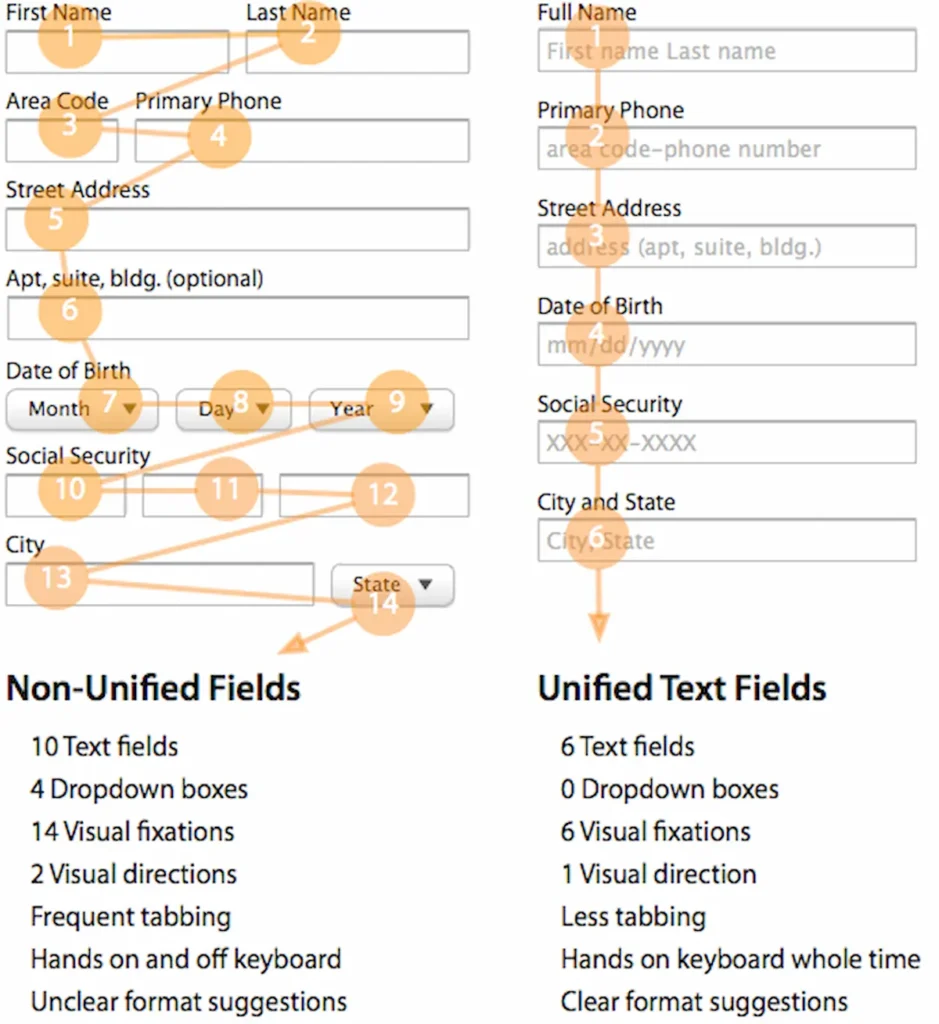
We’re talking phone number, company name and second address lines… most of these are totally unnecessary.
Instead, stick to the minimum required: name, shipping address, payment details, and email.
Also use auto-formatting for credit cards and postal codes, and address auto-fill to make typing easier, especially on mobile.
Small touches like inline validation (so users see mistakes immediately) can also prevent frustration and allow them to submit the form once, rather than two or three times. The easier it is to complete the form, the fewer people abandon it.
These are the features that ThriveCart’s checkout templates already use — with minimal default fields, smart auto-fill features and mobile-friendly layouts that streamline the process straight out of the box.
3) Offer a Guest Checkout Option
Another key way to drive checkout conversion rates is to offer a guest checkout option.
You might have heard of UIE.com’s famous article, The $300 Million Button.
That button in the title? Guest Checkout.
The story goes that when one business implemented a guest checkout option, purchasing went up by 45%. The extra purchases resulted in an extra $15 million the first month. For the first year, the site saw an additional $300,000,000.
When your customers are at the finish line, the last thing they want is another hurdle to jump over. Studies back this up, proving that mandatory account creation is a top reason for cart abandonment, adding friction right before they’re about to pull the trigger.
In other words, make guest checkout the default option.
This lets customers buy instantly, without commitment or delay. After the order is confirmed, you can then invite them to create an account using their existing details – no extra typing required.
This is how you can turn a potential barrier into an easy win, allowing users to buy first and decide later if they want to create an account.
It also earns you brownie points in the customer experience department, conveying that you care more about user experience than data.
Give customers the freedom to check out on their terms, and they’ll keep their eyes on the prize: buying the product that will solve their problem.
4) Choose Between a Single-Page vs. Multi-Step Checkout
Fixing your checkout layout goes a long way in increasing your conversion rate. There are two ways to go about this: a single-page checkout or a multi-page checkout.
A single-page checkout puts all the key information (billing, shipping, and payment) on one screen. This approach reduces clicks, loads faster, and creates a sense of immediacy, which works especially well for simple or impulse purchases.
But if you’re handling more complex orders, a multi-step checkout can feel cleaner and less overwhelming by breaking the process into smaller, focused sections.
5) Making Either Format Work Effectively: Add a Progress Bar
Both approaches benefit from progress indicators. Clear progress bars show customers their current position and remaining steps, reducing uncertainty and abandonment.
Choosing between a multi-step checkout versus a single-page funnel depends on your priorities. Multi-step checkouts can improve completion rates if each page is quick and clearly labeled, while single-page layouts thrive when simplicity and speed are priorities.
Ultimately, there’s no universal best option – you just have to A/B test each one to see which has the higher checkout conversion rate. ThriveCart gives you both single-step and multi-step checkout templates, and lets you A/B test them easily, so you can see which flow drives the highest conversions for your specific audience and product type.
Build Unshakeable Trust and Credibility
Even the most interested customer can hesitate at the checkout, with questions like, “Do I really trust this brand?” or “Are these guys just a scam?”
You’ll want to immediately dispel any doubts, thereby ensuring that buyers know they can totally trust you.
6) Address Customer Concerns Head On
Your checkout page needs to instantly reassure them that their money and data are safe and sound.
Build credibility with visible trust signals: secure payment icons, SSL certificates, and familiar gateways like PayPal or Stripe.
Display social proof, such as customer reviews or satisfaction guarantees, to reinforce confidence. Include clear contact details and transparent refund or return policies so shoppers know you’re legitimate and accessible.
7) Prominently Display Trust Badges and Security Seals
It might seem insignificant but displaying trust badges and security seals will definitely boost your checkout conversion rate.
Seeing familiar security logos, like SSL certificates, Norton Secured, or payment icons from Visa, Mastercard, and PayPal, instantly reassures your customers that their information is protected.
These symbols trigger a sense of safety and legitimacy because they’re associated with recognized, reputable brands. Like back in the 2010s when every restaurant had a TripAdvisor sticker on its window.
It’s a subtle but powerful psychological cue: if trusted companies can vouch for your checkout, it must be secure.
But don’t just place trust badges anywhere, like at the footer where nobody will notice them. Place them where they matter most: directly beside your payment fields, under the “Complete Purchase” button, or near any credit card entry areas.
Prominently displaying trust badges and security seals gives the customer that final little hand-hold before they click “Buy” with confidence.
8) Leverage Social Proof With Testimonials and Reviews
Social proof in the form of testimonials and reviews also helps to get your checkout conversion rate up.
It’s kind of like going to a party and not knowing a single person versus having several friends there. You’re always going to be able to meet more people there if you’ve already got an ‘in’.
Same thing with your testimonials and reviews at your checkout. They signal to the customer that you’re trustworthy, and that they’ll be a satisfied customer too.
A few well-chosen quotes highlighting satisfaction, fast delivery, or excellent support can calm last-minute doubts more than any marketing claim.
Keep them concise and authentic, ideally with names or photos for credibility. Place them near your call-to-action or payment section, where they’ll be seen at the moment of decision.
ThriveCart makes this easy. Users love the built-in testimonial element which lets you drag and drop onto any checkout page, helping you add persuasive social proof without any design or coding effort.
9) Offer Multiple, Recognizable Payment Options
Limited payment methods create unnecessary barriers between interested customers and completed purchases. Payment options in 2025 are flexible, and restricting options often leads to abandoned transactions.
Offering multiple, recognizable payment options can boost your checkout conversion rate.
Start with traditional options like credit and debit cards (Visa, Mastercard, and Amex). Then, add digital wallets such as Apple Pay, Google Pay, and PayPal. Finally, include Buy Now, Pay Later (BNPL) options like Klarna, Afterpay, or Affirm.
In 2025, BNPL has become critical for boosting conversions on higher-priced items, removing that barrier of upfront payment. In fact, BNPL can increase average order values for merchants by 20–40%, and its adoption often substantially boosts conversion rates.
ThriveCart has teamed up with Stripe, giving you access to all these payment methods (cards, digital wallets and BNPL) in a single, secure setup. This gives you a massive trust boost, leading to better conversion rates.
Watch this to find out more: